
Hi! My name is Nataliia. I'm a product designer with 4+ years of experience. I've designed interfaces for a B2B company that helps forex brokers manage risk and trading flows (FX SaaS). Before that — websites and mobile apps in logistics and a digital agency.






Context
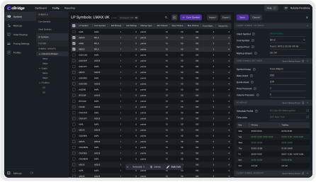
In cBridge, an administrator manages thousands of trading instruments — symbols. When a single setting needs to be changed across dozens of them at once, doing it without bulk editing turns into a lengthy routine with a high risk of error.
Goal
Design a bulk symbol editing interface: how a user enters selection mode, picks the required rows, and applies changes to all of them at once.
Competitor Analysis
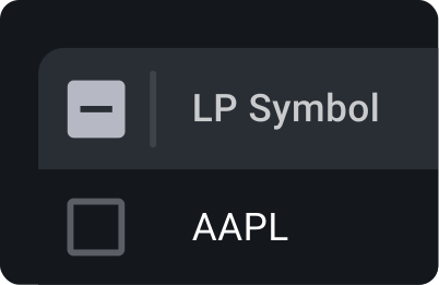
I analyzed how bulk selection is implemented in popular products — email clients, file managers, databases, and content management tools. I used Claude to structure patterns and insights. Across seven products, I identified four universal patterns: a checkbox column, a contextual toolbar on selection, a selected-rows counter, and row highlight. For cBridge, the key distinction was that hover-triggered checkboxes — common in B2C — don't work for operators. They need a permanently visible selection column and mandatory confirmation before destructive actions, since deleting a routing rule directly affects production traffic.
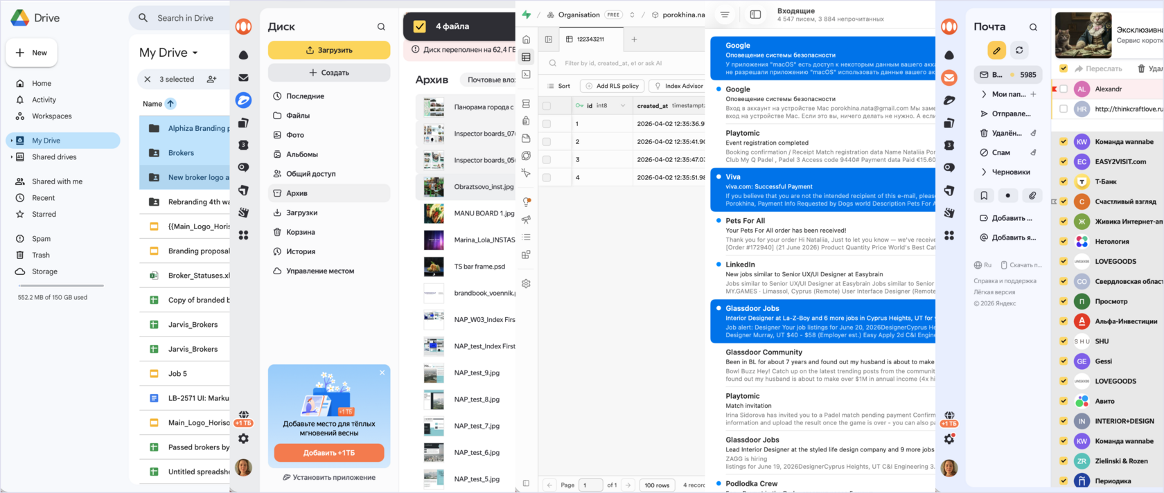
Based on bulk editing patterns, I explored several interaction mechanics in the context of cBridge.
User Testing
Before finalizing the solution, we ran usability tests with colleagues from other teams. I defined three hypotheses:

Findings
Final UI after all iterations
The user enables Multi Edit mode, selects the required symbols, and applies changes to all of them at once — no repeated actions per row
The team: Product Manager, Business Analyst,
Frontend Developer and Designer